Lest you think complex infographics are a modern invention, numerous websites have resurrected a century-old chart with a mind-boggling amount of information on the Civil War.

The Comparative Synoptical Chart Company submitted its creation to the Library of Congress back in 1897. You can still see the faint red stamp by the library’s Register of Copyrights dated Dec. 11, 1897. J. Kellick Bathurst compiled the information.
The so-called historical time chart notes that “this history of the Civil War is drawn to a time scale of months, and the location of all events is entirely governed by this scale.”
It is so densely packed with information that you could spend days poring over the details. Some of the things that jumped out at me: The war cost the federal government $3.4 billion and cost the Confederate government another $3.5 billion — and we’re talking about 19th century money. The cost to local governments in the Northern states was a further $735 million. Unfortunately, many Confederate records were lost, so there is no corresponding dollar amount for the cost to Southern states.
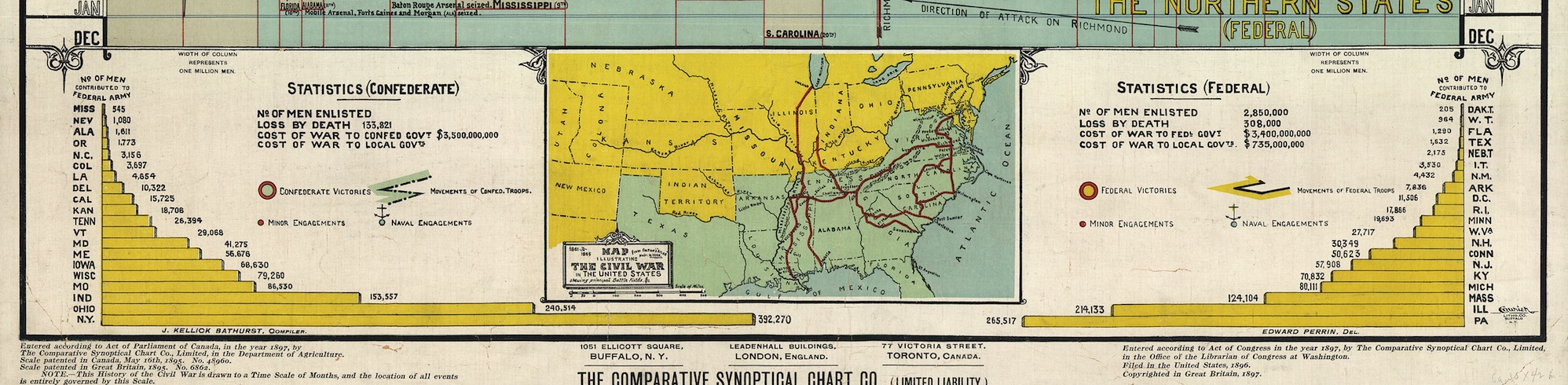
And it was interesting to see that New York state contributed the most men to the federal army, followed by Pennsylvania and Ohio.
The chart is a marvel. I would love to know whether it found a wide audience back in 1897. Perhaps history teachers hung it on classroom walls as a sort of visual CliffsNotes guide for young scholars.
You can find an image of the full chart on Slate.com.

is anyone else aware of the “SIX CENTURIES OF ATTACK AND DEFENSE” also published by the same people in 1898?
LikeLike
I’m not familiar with that, but it sounds fascinating!
LikeLike
I can find no-one who has heard of it. Does this mean that I’m in possession of the only copy extant? Is there anyone out there who can give me a lead?
LikeLike
It sounds like you might have a real treasure on your hands. Have you tried reaching out to the Library of Congress, the National Archives or maybe the folks at Historynet.com…?
LikeLike
Hi Andrew and Terri
Amazing chart.
I too have a copy of the attach and defense chart
It would be interesting to see how many of these exist
LikeLike
Now I really want to see this chart! Anyone know if a PDF exists online? And where are you guys getting these charts??
LikeLike
Nice to know there’s at least one other copy of Attack and Defense out there. I no longer have my copy – I have given it to the author’s great granddaughter (who I tracked down) as it seemed she was the best person to look after it
LikeLike
I have found a couple of photos of the chart that we took before passing it on but i’ve no idea how to attach them to this – can anyone advise?
LikeLike
Andrew: I don’t think you can attach a file to a comment, but if you want to email me the photos, I’ll see if I can add them to the original blog post, or I’ll create a new one. TerriHuck.writer@gmail.com
LikeLike